# Reinitialize Faker and all required components for dataset generation
from faker import Faker
import numpy as np
import pandas as pd
fake = Faker(['de_DE']) # German locale for more authentic usernames
num_rows = 500
ids = np.arange(1, num_rows + 1)
usernames_blue_party = [f"blue_{fake.user_name()}" for _ in range(num_rows // 2)]
usernames_green_party = [f"green_{fake.user_name()}" for _ in range(num_rows // 2)]
usernames = np.array(usernames_blue_party + usernames_green_party)
np.random.shuffle(usernames) # Shuffle to mix parties
# Manually generated Lorem Ipsum text snippets
lorem_ipsum_texts = [
"Lorem ipsum dolor sit amet, consectetur adipiscing elit.",
"Sed do eiusmod tempor incididunt ut labore et dolore magna aliqua.",
"Ut enim ad minim veniam, quis nostrud exercitation ullamco laboris nisi ut aliquip ex ea commodo consequat.",
"Duis aute irure dolor in reprehenderit in voluptate velit esse cillum dolore eu fugiat nulla pariatur.",
"Excepteur sint occaecat cupidatat non proident, sunt in culpa qui officia deserunt mollit anim id est laborum."
] * (num_rows // 5) # Repeat the list to cover all rows
# Assign parties
parties = np.array(["Blue Party" if "blue_" in username else "Green Party" for username in usernames])
# Positioning: More Trues for Blue Party, balanced for Green Party
positioning = np.array([np.random.choice([True, False], p=[0.7, 0.3]) if party == "Blue Party" else np.random.choice([True, False], p=[0.3, 0.7]) for party in parties])
# Create DataFrame
df = pd.DataFrame({
"ID": ids,
"Username": usernames,
"Text": lorem_ipsum_texts,
"Party": parties,
"Positioning": positioning
})Reporting
This chapter showcases several approaches to testing and reporting the results of your research questions. The first section, statistical analysis, takes a look at \(\chi^2\) tests to check for statistically significant differences between groups. This example can easily converted for different questions and scenarios. In the second section we take a look at descriptive analysis, creating plots using matplotlib and RAWGraphs. The last section takes a look at the data analysis GPT available to ChatGPT Plus subscribers.
Statistical Analysis
The research question for our example-study is: “Does political party affiliation influence the positioning stance of social media posts?” This question aims to investigate whether there is a significant relationship between the political party (either “Blue Party” or “Green Party”) associated with social media accounts and the likelihood of those accounts posting content with a positioning stance classified as True or False. By examining this relationship, we seek to understand if and how political biases or affiliations might affect the messaging and communication strategies employed on visual social media platforms.
Let’s create some random data data, similar to Story or TikTok dataframes. In this example we have one row per post. Each post has been created by a random useraccount. We want to check for statistically significant differences in Positioning between the Blue and the Green party. Let’s imagine Positioning to be a variable classified by GPT-4. It inidicates whether a given post contains any referrences to policy issues.
For a real-world analysis we would have added the Party variable manually. We would could i.e. create a dictionary and map usernames to parties using the dictionary and pandas:
party_mapping = {
  'Blue Party': ['blue_mirjanahentschel', 'blue_eric85', 'blue_hofmanndominik', ...],
  'Green Party': ['green_buchholzuwe', 'green_wlange', 'green_istvan48', ...]
}
df['Party'] = df['Username'].map({user: party for party, users in party_mapping.items() for user in users})Let’s take a look at our random data.
df.head()| ID | Username | Text | Party | Positioning | |
|---|---|---|---|---|---|
| 0 | 1 | green_bgude | Lorem ipsum dolor sit amet, consectetur adipis... | Green Party | True |
| 1 | 2 | green_hans-guenter82 | Sed do eiusmod tempor incididunt ut labore et ... | Green Party | False |
| 2 | 3 | blue_hermaetzold | Ut enim ad minim veniam, quis nostrud exercita... | Blue Party | True |
| 3 | 4 | blue_h-dieter08 | Duis aute irure dolor in reprehenderit in volu... | Blue Party | False |
| 4 | 5 | green_vesnaseifert | Excepteur sint occaecat cupidatat non proident... | Green Party | True |
With our randomly generated dataset at hand, let’s formulate a hypothesis: if political party affiliation (either “Blue Party” or “Green Party”) influences the positioning of social media posts (categorized as either True or False), then we should observe a statistically significant difference in the frequency of True positioning statements between the two parties.
H1 There is a significant association between a post’s political party affiliation—categorized into two fictional parties, the “Blue Party” and the “Green Party”—and its positioning, which is dichotomized into true or false stances.
H0 There is no statistically significant association between party affiliation and the positioning of social media posts, implying that any observed differences in the distribution of positioning stances across the two parties could be attributed to chance.
For our analysis, we have chosen the chi-square (χ²) test, a statistical method, to examine the relationship between the “Party” and “Positioning” variables in our dataset. This decision is based on the nature of our data: both variables are categorical, with “Party” dividing posts into two distinct groups and “Positioning” being a binary outcome. The chi-square test is suited for this scenario because it allows us to determine if there is a statistically significant association between the political party affiliation and the positioning stance within our social media posts. By comparing the observed frequencies of “True” and “False” positioning within each party to the frequencies we would expect by chance, the chi-square test provides a clear, quantitative measure of whether our variables are independent or, conversely, if there is a pattern to the positioning that correlates with party affiliation.
Tip
I recommend the “Methodenberatung” by Universität Zürich (UZH), which is an interactive decision tree that helps to pick the correct statistical test for different kinds of questions.
from scipy.stats import chi2_contingency

# Create a contingency table
contingency_table = pd.crosstab(df['Party'], df['Positioning'])

# Perform chi-square test of independence
chi2, p_value, dof, expected = chi2_contingency(contingency_table)

print(f"chi^2 statistics: {chi2} \n p-value: {p_value}")
chi^2 statistics: 21.193910256410255
p-value: 4.15081289863548e-06The chi-square test of independence results in a chi-square statistic of approximately 21.19 and a very low p-value, which is significantly less than the common threshold of 0.05. This indicates that there is a statistically significant difference in the distribution of “Positioning” between the “Blue Party” and the “Green Party”.
Let’s check the contingency table for a descriptive analysis of the distribution:
contingency_table| Positioning | False | True |
|---|---|---|
| Party | ||
| Blue Party | 14 | 36 |
| Green Party | 38 | 12 |
To understand the strength of the association observed in the chi-square test of independence between the “Party” and “Positioning” variables, we can calculate the effect size. One commonly used measure of effect size for chi-square tests in categorical data is Cramer’s V. Cramer’s V ranges from 0 (no association) to 1 (perfect association), providing insight into the strength of the relationship between the two variables beyond merely its statistical significance.
Cramer’s V is calculated as follows:
\(V = \sqrt{\frac{\chi^2}{n(k-1)}}\)
where: - \(\chi^2\) is the chi-square statistic, - \(n\) is the total sample size, - \(k\) is the smaller number of categories between the two variables (in this case, since both variables are binary, (k = 2)).
Let’s calculate Cramer’s V for our dataset to assess the effect size of the association between “Party” and “Positioning”.
# Calculate Cramer's V
n = df.shape[0]  # Total number of observations
k = min(contingency_table.shape)  # The smaller number of categories between the two variables
cramers_v = np.sqrt(chi2 / (n * (k - 1)))

print(f"Cramérs V: {cramers_v}")
Cramérs V: 0.4603684421896255The calculated effect size, using Cramer’s V, for the association between “Party” and “Positioning” in our dataset is approximately 0.460. This indicates a moderate association between the political party affiliation and the positioning stance of the posts. In practical terms, this means that the difference in the distribution of “Positioning” between the “Blue Party” and the “Green Party” is not only statistically significant but also of a considerable magnitude, highlighting a strong relationship between party affiliation and the likelihood of adopting a particular positioning in our fictional social media dataset.
When reporting the results of our chi-square test of independence and the effect size using APA guidelines, it’s important to provide a clear and concise description of the statistical findings along with the context of the analysis. Here’s how you might structure your report:
“In the analysis examining the association between political party affiliation (Blue Party vs. Green Party) and the positioning of social media posts (True vs. False), a chi-square test of independence was conducted. The results indicated a statistically significant association between party affiliation and positioning, χ²(1, N=50) = 21.19, p < .001. To assess the strength of this association, Cramer’s V was calculated, revealing an effect size of V = 0.460, which suggests a moderate association between the two variables. These findings suggest that political party affiliation is significantly related to the positioning stance taken in social media posts within this dataset.”
Descriptive Analysis
In this section, we take a look at the descriptive analysis of our synthetically generated dataset, focusing on political party affiliations, the positioning of social media posts, and the mentioning of specific policy issues over a defined time period. By categorizing and counting the occurrences of discussions related to policy domains—such as the economy, environment, healthcare, education, and foreign policy—across different dates, we aim to uncover patterns that may illuminate how political narratives and priorities are presented in social media content. This type of analysis offers a snapshot of the temporal dynamics within our fictional political landscape.
At first we need to add a date to each post.
import datetime

# Generate a week's range of dates
start_date = datetime.date(2023, 1, 1)
date_range = [start_date + datetime.timedelta(days=x) for x in range(7)]

# Assign a random date to each row
df['Date'] = np.random.choice(date_range, size=num_rows)
Then we create a new dataframe counting posts per day by each party. We are going to use this table to create a stacked barplot using python. Afterwards we extend the fake dataset by adding policy issues to posts and export the data for use with RAWGraphs.
# Create a new DataFrame focusing on counts of policy issues by date
parties_counts = df.groupby(['Date', 'Party']).size().reset_index(name='Count')
Now we have a table with one row per data and party counting the daily posts of each party.
parties_counts.head()| Date | Party | Count | |
|---|---|---|---|
| 0 | 2023-01-01 | Blue Party | 31 |
| 1 | 2023-01-01 | Green Party | 27 |
| 2 | 2023-01-02 | Blue Party | 42 |
| 3 | 2023-01-02 | Green Party | 35 |
| 4 | 2023-01-03 | Blue Party | 48 |
Using matplotlib we can create the stacked bargraph.
import matplotlib.pyplot as plt

# Pivot the DataFrame to get the data in the required format for a stacked barplot
pivot_df = parties_counts.pivot(index='Date', columns='Party', values='Count').fillna(0)

# Define custom colors for parties
party_colors = {
    'Blue Party': 'blue',
    'Green Party': 'green'
}

# Create a stacked barplot with custom colors
ax = pivot_df.plot(kind='bar', stacked=True, color=[party_colors[party] for party in pivot_df.columns])

# Set the X and Y axis labels
ax.set_xlabel('Date')
ax.set_ylabel('Count')

# Set the title
ax.set_title('Stacked Barplot of Posts by Date Grouped by Party')

# Show the legend
plt.legend(title='Party', loc='upper right')

# Show the plot
plt.show()
Next, let’s add the fake policy issues to our synthetic data.
# Define five "Policy Issue" categories
policy_issues = ["Economy", "Environment", "Healthcare", "Education", "Foreign Policy"]

# Assign a "Policy Issue" to posts where Positioning is True
# Posts with Positioning as False will have "None" or a placeholder
df['Policy Issue'] = np.where(df['Positioning'], np.random.choice(policy_issues, size=num_rows), None)df.head()| ID | Username | Text | Party | Positioning | Date | Policy Issue | |
|---|---|---|---|---|---|---|---|
| 0 | 1 | green_fedorloeffler | Lorem ipsum dolor sit amet, consectetur adipis... | Green Party | True | 2023-01-02 | Foreign Policy |
| 1 | 2 | green_mattiastrueb | Sed do eiusmod tempor incididunt ut labore et ... | Green Party | False | 2023-01-02 | None |
| 2 | 3 | green_jaekelguelten | Ut enim ad minim veniam, quis nostrud exercita... | Green Party | True | 2023-01-03 | Healthcare |
| 3 | 4 | green_zboerner | Duis aute irure dolor in reprehenderit in volu... | Green Party | False | 2023-01-05 | None |
| 4 | 5 | green_alexandragotthard | Excepteur sint occaecat cupidatat non proident... | Green Party | False | 2023-01-06 | None |
And once more, let’s create a new table that counts the daily occurences of policy issues.
# Create a new DataFrame focusing on counts of policy issues by date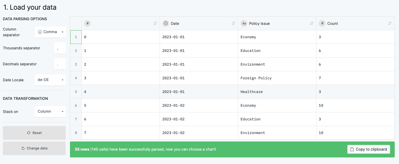
policy_issue_counts = df[df['Positioning']].groupby(['Date', 'Policy Issue']).size().reset_index(name='Count')policy_issue_counts.head()| Date | Policy Issue | Count | |
|---|---|---|---|
| 0 | 2023-01-01 | Economy | 3 |
| 1 | 2023-01-01 | Education | 6 |
| 2 | 2023-01-01 | Environment | 6 |
| 3 | 2023-01-01 | Foreign Policy | 7 |
| 4 | 2023-01-01 | Healthcare | 3 |
Finally we export the data as a CSV file for use with RAWGraphs.
policy_issue_counts.to_csv('2024-02-05-Fake-Issues-Per-Day.csv')RAWGraphs
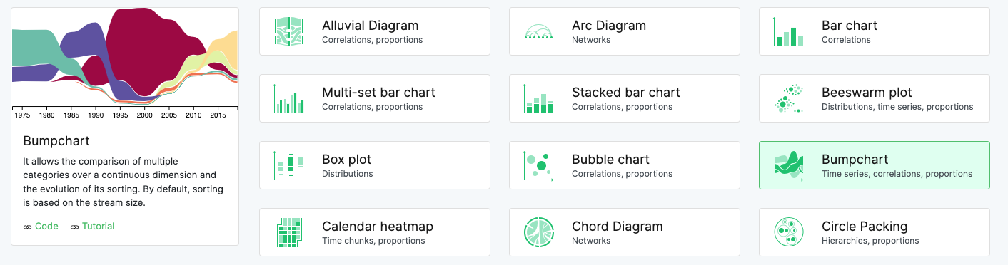
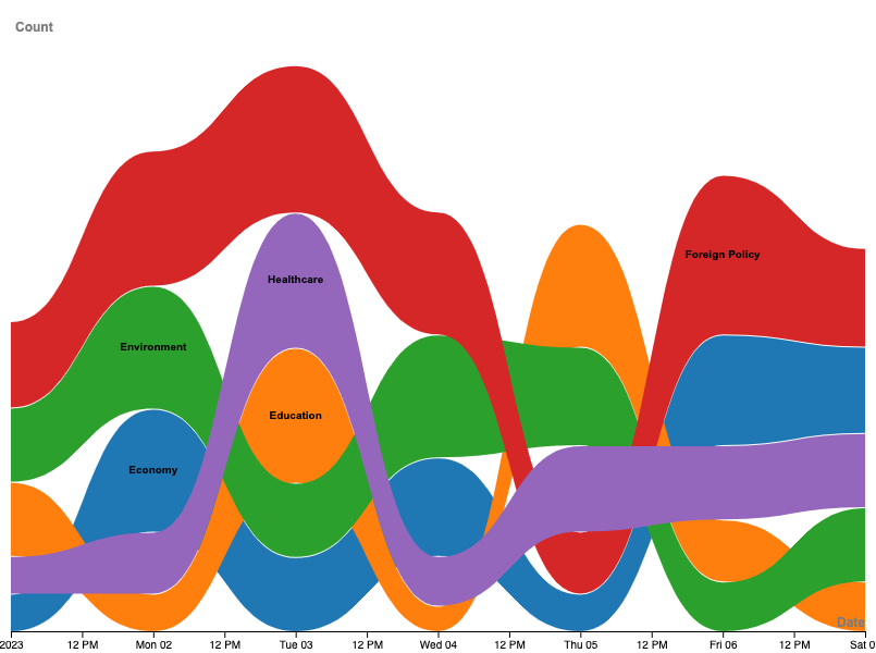
RAWGraphs offers a graphical user interface to create appealing data visualizations. Additionally, charts may be downloaded in vector formats, making the files losslessly compatible with software like Gimp or Photoshop. Follow the steps below to import our fake data into RAWGraphs to create a bumpcharts of policy issues mentioned over time. As with the statistical analysis, this is just one example of many possibilities for data visualization! matplotlib is still a powerful tool, capable of creating complex visualizations. Additionally, since its available in our python environment, matplotlib is often the go-to tool for quick visualizations. RAWGraphs, on the other hand, has a shallower learning curve, and the export to graphic editors facilitates the design of information graphics.


Experimental: Analysis using ChatGPT
The ChatGPT Plus subscription offers access to custom GPTs and the Data Analysis functionalities. I created a very shallow example using the fake data above. We import the CSV file into a chat session to interactively ask questions about the dataset. GPT generates the python code necessary to answer our questions and processes the data in the background, eventually presenting the results as a paragraph of text contextualizing the results. Additionally, the python code for every step is available.

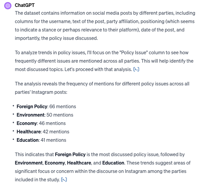


Personally, I would warn against an excess use of the data analysis GPT: It is useful and helps to cut down time for many mundane tasks (like cleaning or reshaping dataframes). Lots of questions are answered correctly and the dialog with the model may reveal some new insights. Yet, the longer the dialog and the deeper and more complex the analysis, the accuracy of the model and its analysis starts to crumble. This will probably happen less and less with time and updated.
Conclusion
This chapter introduced one exemplar approach for testing research questions and several ideas for exploring and reporting on your data and insights. The Descriptive Analysis section is usually part of your Results chapter: Provide an overview of your collected data, provide some measures, maybe some plots describing your corpus. The statistical tests, on the other hand, are your analysis, as such add them to your Analysis section. A timeline analysis, as showcased with the bumpchart, may be motivated by a research question and hypothesis, as such I would expect it in the Analysis section as well. Overall, a proper project report includes both, descriptive and statistical analysis. Finally we took a look at the data analysis GPT. I do recommend to test the data analysis GPT, however for the moment I’d recommend to conduct your own analysis using your own jupyter notebooks to guarantee correctness of your tests.
Citation
BibTeX citation:
@online{achmann-denkler2024,
  author = {Achmann-Denkler, Michael},
  title = {Reporting},
  date = {2024-02-05},
  url = {https://social-media-lab.net/reporting/},
  doi = {10.5281/zenodo.10039756},
  langid = {en}
}
For attribution, please cite this work as:
Achmann-Denkler, Michael. 2024. “Reporting.” February 5,
2024. https://doi.org/10.5281/zenodo.10039756.